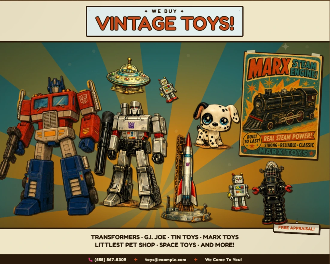
Nine characters.
One retro poster.
Every pixel intentional.
A vintage toy shop poster where every character is a clickable hotspot. Clicking reveals an ink-styled panel with copy, a category tag, and a navigation link — all animated with spring physics and a slight rotation. The sunburst background is procedurally generated SVG. The layout has two distinct responsive modes driven by a ResizeObserver on the component itself, not the viewport. No portals, no third-party animation libraries.
- Next.js
- TypeScript
- CSS Modules
- SVG
- ResizeObserver
Designing a Navigational Object
The poster is the navigation. The challenge is making that legible without breaking the illusion.
Most interactive posters signal clickability with hover borders or cursor changes and leave it at that. The goal here was for the interactivity to feel like part of the artifact — something a vintage poster might actually do if it came to life — rather than a UI layer bolted on top. Every affordance had to earn its place without breaking the retro aesthetic.
The reveal panels are styled as hand-pinned cards: parchment background, ink border, a slight rotation, a hanging string above. They appear with a spring animation — scaling up from near-zero with a bounce — so the entrance feels physical rather than digital. The rotation direction alternates by panel side to reinforce the sense that each card is pinned independently.
The "TAP TO LEARN MORE" hint appears only on hover, positioned near each character rather than in a fixed UI location. It fades in and out without interrupting the scene. On touch devices where hover doesn't exist, the poster works purely by tap — the hint is a progressive enhancement, not a required affordance.
The two-mode responsive layout — landscape and portrait — isn't just scaled down. Character positions, panel anchor points, and hint positions all have separate coordinate sets for each mode. The background SVG recomputes its height and sparkle positions for portrait. The transition between modes is driven by a ResizeObserver on the poster element itself, so it responds to the component's actual rendered width rather than the browser viewport — which matters when the poster is embedded in a constrained container.
Technical implementation follows ↓
Technical Stack
Every choice was deliberate. Here's the rationale.
| Framework | Next.js — App Router The poster is a single interactive page but lives inside a larger site. App Router gives per-route metadata, canonical URLs, and next/image optimisation for the character assets — all with zero configuration overhead. |
| Styling | CSS Modules All visual fidelity — spring animations, transform-origin per panel side, ink-bleed pseudo-elements, the sunburst ray rotation — is pure CSS. No animation library was needed. CSS Modules keep every selector scoped without a runtime. |
| Responsiveness | ResizeObserver on the element Layout mode switches at a content breakpoint, not a viewport breakpoint. A ResizeObserver watches the poster element directly, so the two-mode layout works correctly whether the poster fills the viewport or is embedded inside a narrower container. |
| Background | Procedural SVG The sunburst, gradients, grain filter, vignette, and sparkles are all generated at render time in a React component — no image assets, no external files. The ray coordinates are computed trigonometrically so the burst recentres correctly for portrait height. |
| Content | zones.ts data layer All nine hotspots — positions, copy, tag colours, panel side, href — live in a single typed data file. Adding or editing a zone requires touching one object, not hunting through component logic. |
Animating Without a Library
The spring physics are CSS. The challenge was composing transforms correctly.
The reveal panels needed to feel physical — scaling up from a small, rotated state with a slight overshoot. The naive approach is a JS animation library. The actual solution is a single cubic-bezier and two composed transforms, with the inactive and active states defined entirely in CSS.
The tricky part is that each panel has three transform components in play at once: scale, rotate, and on small screens atranslateX(-50%) for centering. CSS transitions operate on the full transform value, so all three must be declared together in every state — omitting one causes it to snap rather than animate. Thetransform-origin also differs by panel side, so left-anchored panels spring from the top-right and right-anchored panels from the top-left, giving each card its own pivot point.
/* RevealPanel.module.css — spring entrance, no JS */

.panel {
  transform: scale(0.3) rotate(-10deg);
  transform-origin: top left;
  transition:
    opacity  0.2s ease,
    transform 0.28s cubic-bezier(0.34, 1.56, 0.64, 1);
}

.panel.left  { transform-origin: top right; }
.panel.right { transform-origin: top left;  }

.panel.active            { transform: scale(1) rotate(-2deg); }
.panel.left.active  { transform: scale(1) rotate( 2deg); }
.panel.right.active { transform: scale(1) rotate(-2deg); }